
Kylin on Cloud — Build A Data Analysis Platform on the Cloud in Two Hours Part 2
This is the second part of the blog series, for part 1, see :Kylin on Cloud — Build A Data Analysis Platform on the Cloud in Two Hours Part 1
Video Tutorials
Kylin on Cloud — Build A Data Analysis Platform on the Cloud in Two Hours Part 2
Kylin query cluster
Start Kylin query cluster
-
Besides the
kylin_configs.yamlfile for starting the build cluster, we will also enable MDX with the command below:ENABLE_MDX: &ENABLE_MDX 'true' -
Then execute the deploy command to start the cluster:
python deploy.py --type deploy --mode query
Query with Kylin
-
After the query cluster is successfully started, first execute
python deploy.py --type listto get all node information, and then type in your browserhttp://${kylin_node_public_ip}:7070/kylinto log in to Kylin web UI: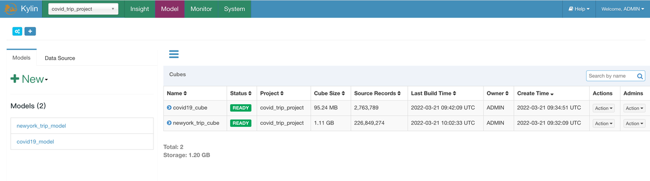
-
Execute the same SQL on Insight page as what we have done with spark-SQL:
select TAXI_TRIP_RECORDS_VIEW.PICKUP_DATE, NEWYORK_ZONE.BOROUGH, count(*), sum(TAXI_TRIP_RECORDS_VIEW.TRIP_TIME_HOUR), sum(TAXI_TRIP_RECORDS_VIEW.TOTAL_AMOUNT)
from TAXI_TRIP_RECORDS_VIEW
left join NEWYORK_ZONE
on TAXI_TRIP_RECORDS_VIEW.PULOCATIONID = NEWYORK_ZONE.LOCATIONID
group by TAXI_TRIP_RECORDS_VIEW.PICKUP_DATE, NEWYORK_ZONE.BOROUGH;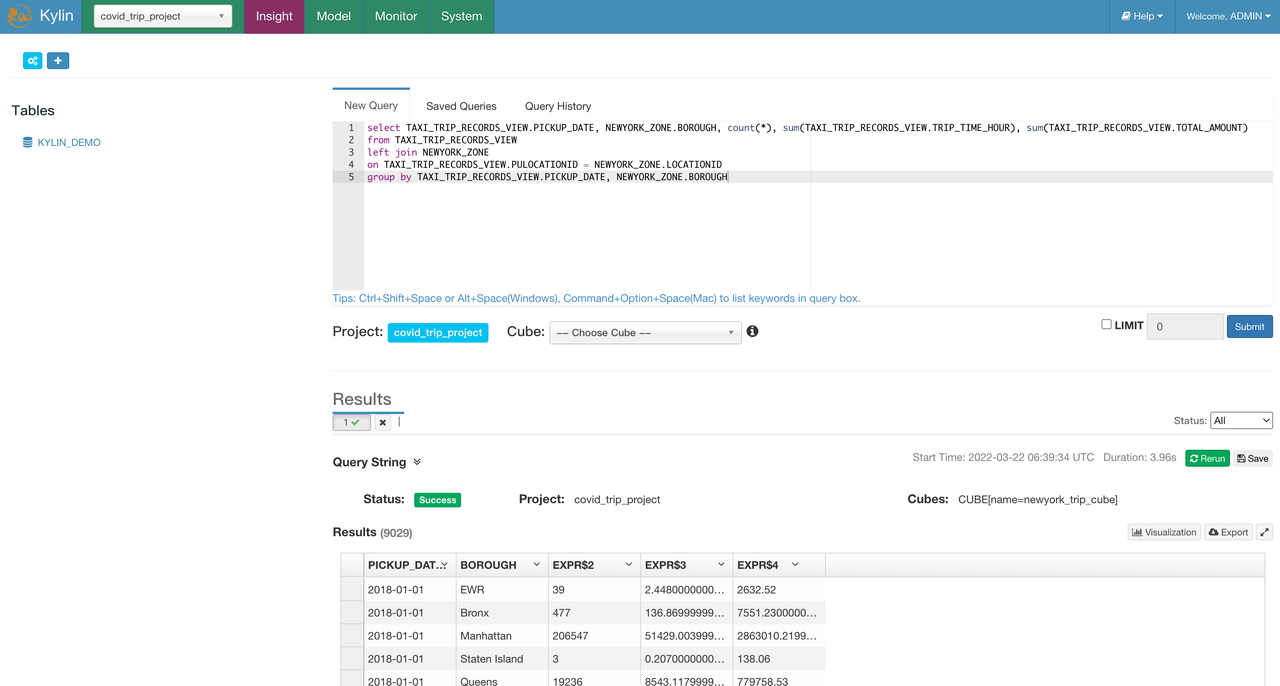
As we can see, when the query hits the cube, that is, the query is directly answered by the pre-computed data, the query result is returned in about 4s, a great reduction from the over 100s of query latency.
Pre-computation reduces query cost
In this test, we used the New York taxi order data with fact table containing 200+ million entries of data. As we can see from the result, Kylin has significantly improved the query efficiency in this big data analysis scenario against hundreds of millions of data entries. Moreover, the build data could be reused to answer thousands of subsequent queries, thereby reducing query cost.
Configure semantic layer
Import Dataset into MDX for Kylin
With MDX for Kylin, you can create Dataset based on the Kylin Cube, define Cube relations, and create business metrics. To make it easy for beginners, you can directly download Dataset file from S3 and import it into MDX for Kylin:
-
Download the dataset to your local machine from S3.
wget https://s3.cn-north-1.amazonaws.com.cn/public.kyligence.io/kylin/kylin_demo/covid_trip_project_covid_trip_dataset.json -
Access
MDX for Kylinweb UIEnter
http://${kylin_node_public_ip}:7080in your browser to accessMDX for Kylinweb UI and log in with the default username and passwordADMIN/KYLIN:
-
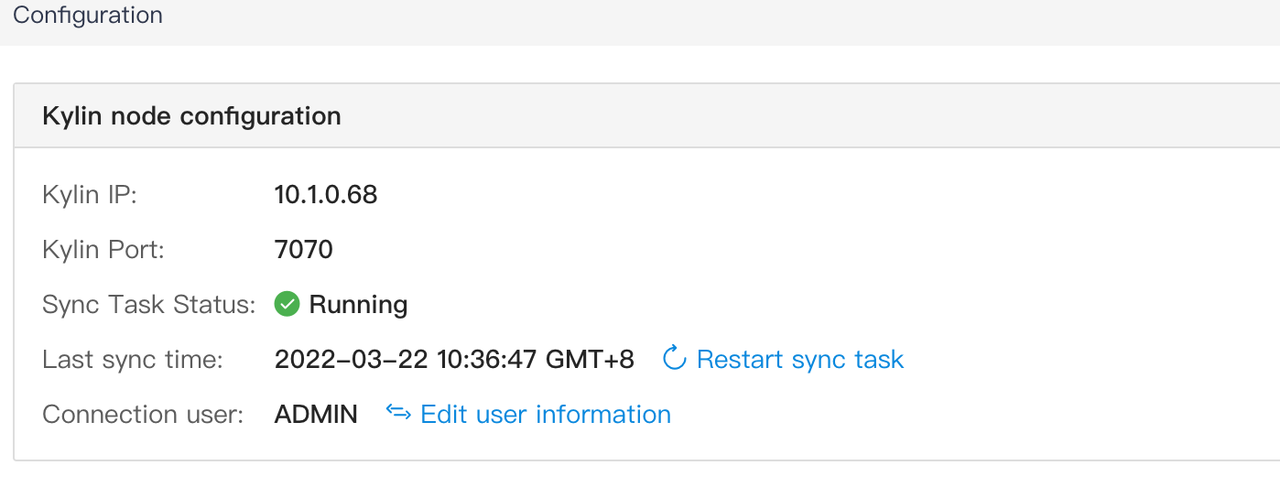
Confirm Kylin connection
MDX for Kylinis already configured with the information of the Kylin node to be connected. You only need to type in the username and password (ADMIN/KYLIN) for the Kylin node when logging in for the first time.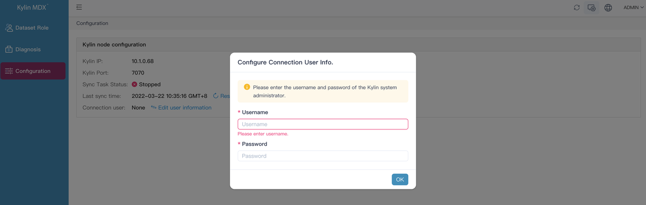
-
Import Dataset
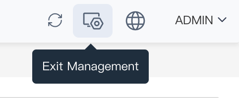
After Kylin is successfully connected, click the icon in the upper right corner to exit the management page:
Switch to the
covid_trip_projectproject and clickImport DatasetonDatasetpage: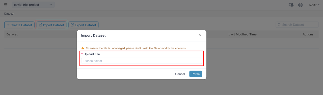
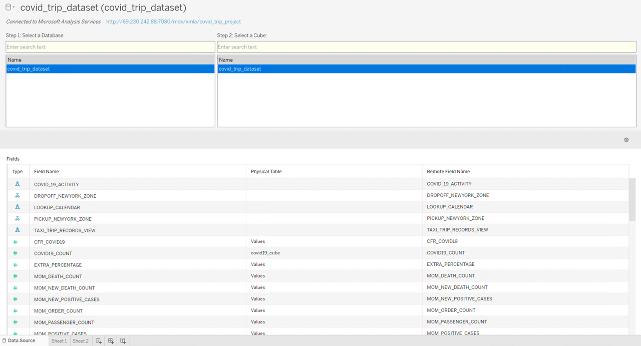
Select and import the
covid_trip_project_covid_trip_dataset.jsonfile we just download from S3.covid_trip_datasetcontains specific dimensions and measures for each atomic metric, such as YTD, MTD, annual growth, monthly growth, time hierarchy, and regional hierarchy; as well as various business metrics including COVID-19 death rate, the average speed of taxi trips, etc. For more information on how to manually create a dataset, see Create dataset inMDX for Kylinor MDX for Kylin User Manual.
Data analysis with BI and Excel
Data analysis using Tableau
Let’s take Tableau installed on a local Windows machine as an example to connect to MDX for Kylin for data analysis.
-
Select Tableau’s built-in
Microsoft Analysis Serviceto connect toMDX for Kylin. (Note: Please install theMicrosoft Analysis Servicesdriver in advance, which can be downloaded from Tableau).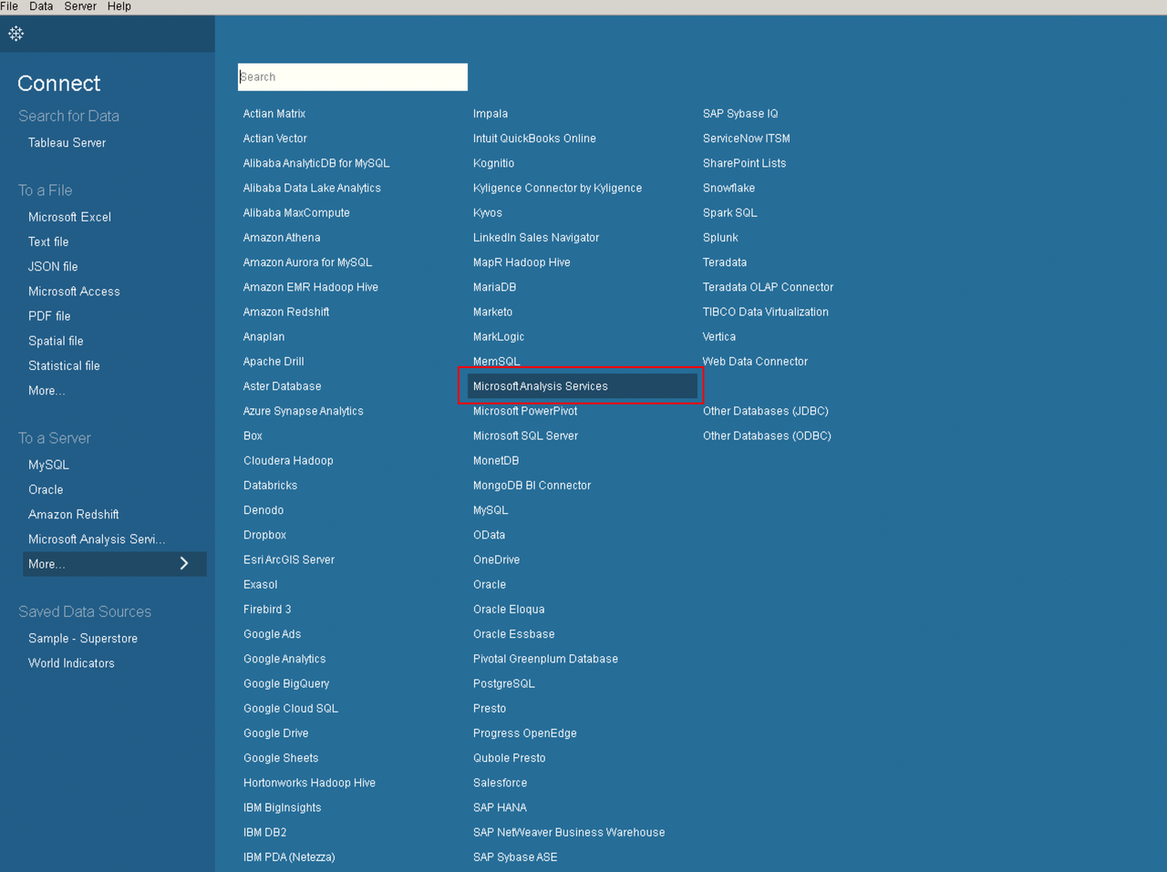
-
In the pop-up settings page, enter the
MDX for Kylinserver address, the username and password. The server address ishttp://${kylin_node_public_ip}:7080/mdx/xmla/covid_trip_project: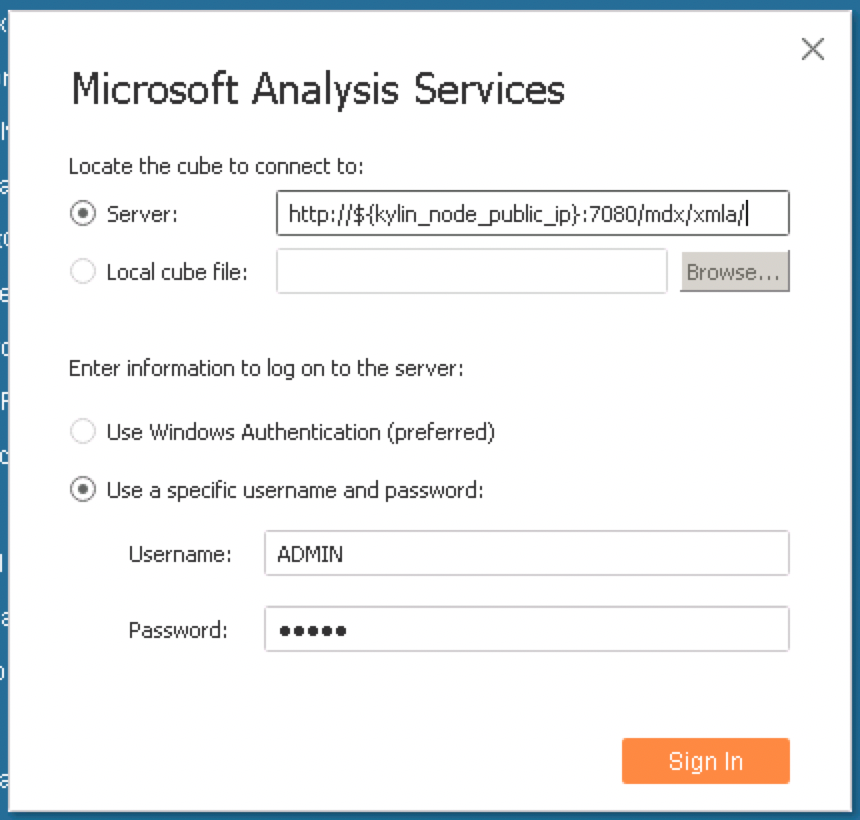
-
Select covid_trip_dataset as the dataset:
-
Then we can run data analysis with the worksheet. Since we have defined the business metrics with
MDX for Kylin, when we want to generate a business report with Tableau, we can directly drag the pre-defined business metrics into the worksheet to create a report. -
Firstly, we will analyze the pandemic data and draw the national-level pandemic map with the number of confirmed cases and mortality rate. We only need to drag and drop
COUNTRY_SHORT_NAMEunderREGION_HIERARCHYto the Columns field and drop and dropSUM_NEW_POSITIVE_CASESandCFR_COVID19(fatality rate) under Measures to the Rows field, and then select to display the data results as a map: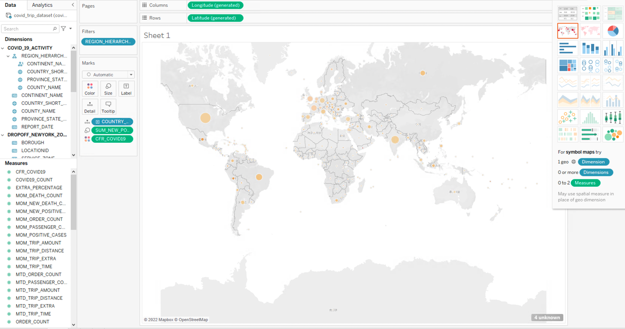
The size of the symbols represents the level of COVID-19 death count and the shade of the color represents the level of the mortality rate. According to the pandemic map, the United States and India have more confirmed cases, but the mortality rates in the two countries are not significantly different from the other countries. However, countries with much fewer confirmed cases, such as Peru, Vanuatu, and Mexico, have persistently high death rates. You can continue to explore the reasons behind this if you are interested.
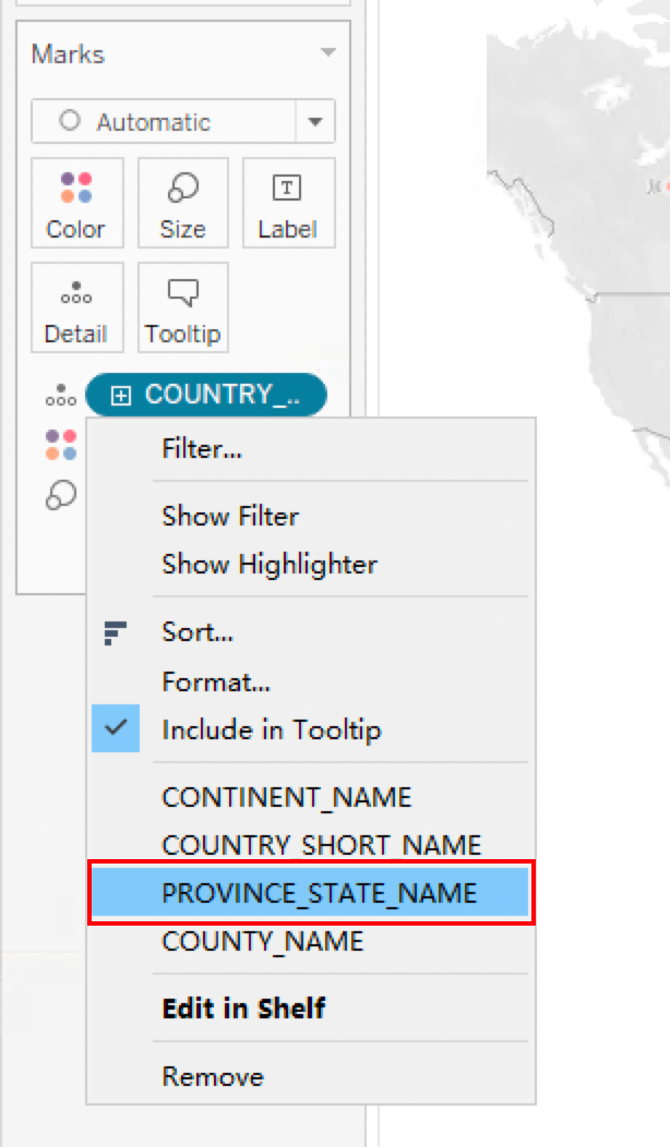
Since we have set up a regional hierarchy, we can break down the country-level situation to the provincial/state level to see the pandemic situation in different regions of each country:
Zoom in on the COVID map to see the status in each state of the United States:
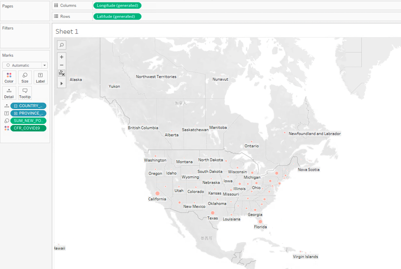
It can be concluded that there is no significant difference in the mortality rate in each state of the United States, which is around 0.01. In terms of the number of confirmed cases, it is significantly higher in California, Texas, Florida, and New York City. These regions are economically developed and have a large population. This might be the reason behind the higher number of confirmed COVID-19 cases. In the following part, we will combine the pandemic data with the New York taxi dataset to analyze the impact of the pandemic on the New York Taxi industry.
-
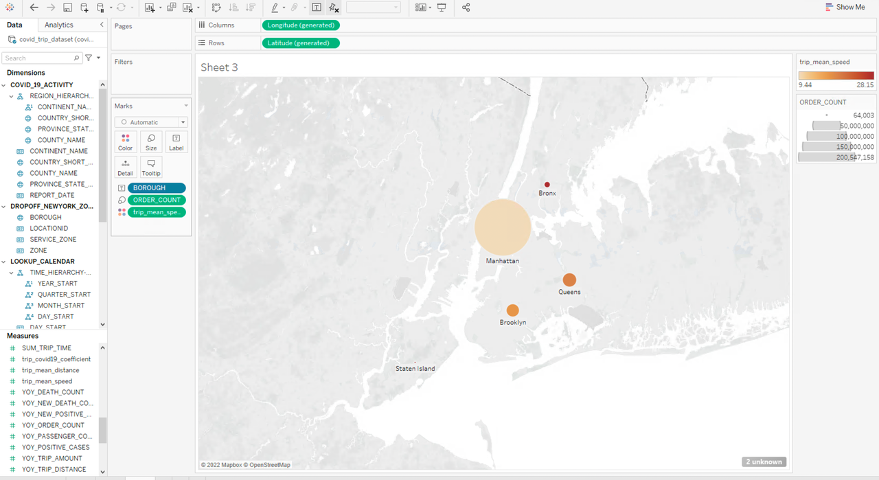
For the New York taxi order dataset, we want to compare the order numbers and travel speed in different boroughs.
Drag and drop BOROUGH under PICKUP_NEWYORK_ZONE to Columns, and drag and drop ORDER_COUNT and trip_mean_speed under Measures to Rows, and display the results as a map. The color shade represents the average speed and the size of the symbol represents the order number. We can see that taxi orders departing from Manhattan are higher than all the other boroughs combined, but the average speed is the lowest. Queens ranks second in terms of order number while Staten Island has the lowest amount of taxi activities. The average speed of taxi trips departing from the Bronx is 82 mph, several times higher than that of the other boroughs. This also reflects the population density and the level of economic development in different New York boroughs.

Then we will replace the field BOROUGH from PICKUP_NEWYORK_ZONE with BOROUGH from DROPOFF_NEWYORK_ZONE, to analyze the number of taxi orders and average speed by drop-off ID:
The pick-up and drop-off data of Brooklyn, Queens, and Bronx differ greatly, for example, the taxi orders to Brooklyn or Bronx are much higher than those departing from there, while there are much fewer taxi trips to Queens than those starting from it.
- Travel habits change after the pandemic (long-distance vs. short-distance travels)
To analyze the average trip mileage we can get the residents’ travel habit changes, drag and drop dimension MONTH_START to Rows, and drag and drop the metric trip_mean_distance to Columns:
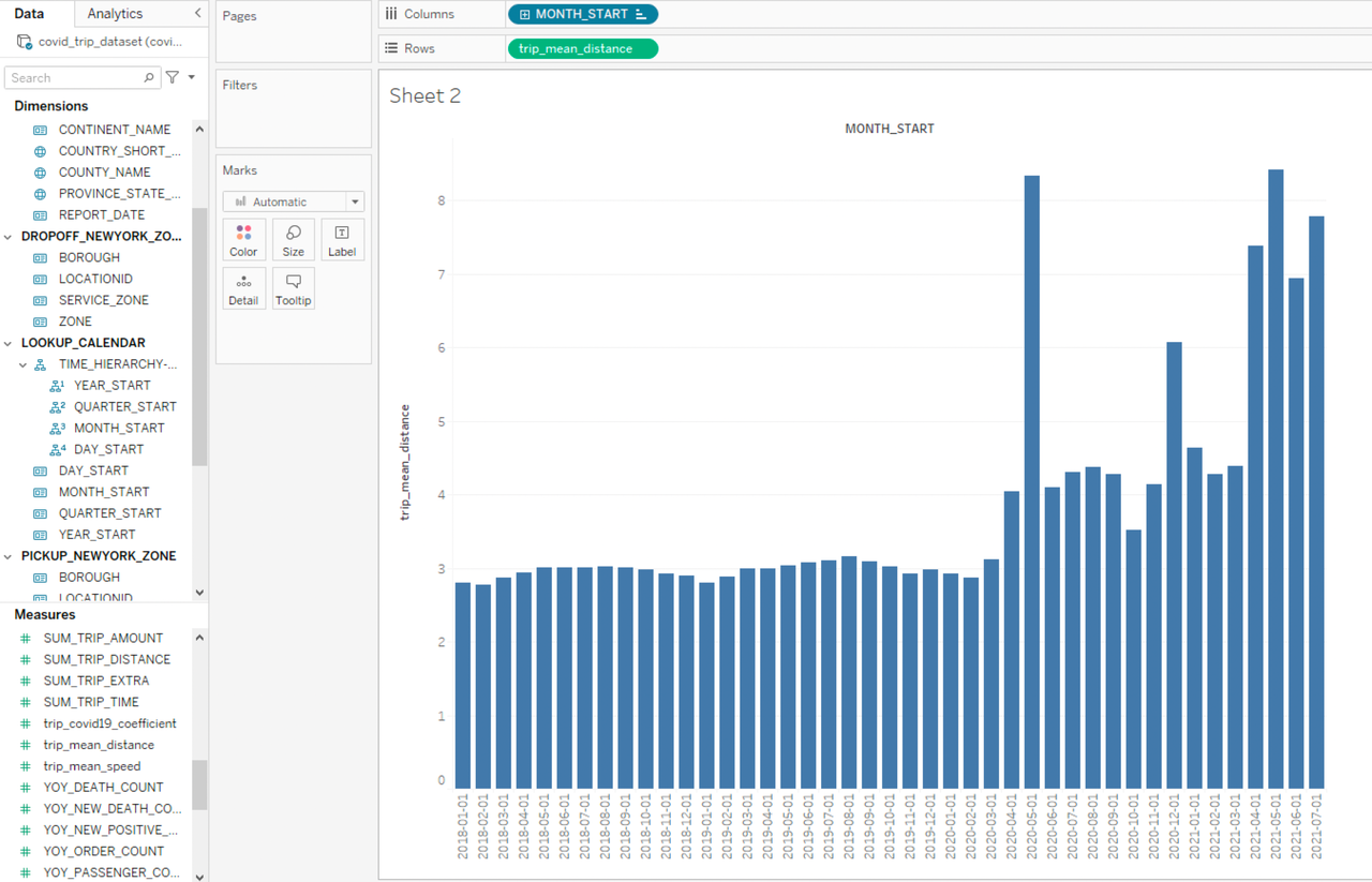
Based on the histogram we can see that there have been significant changes in people’s travel behavior before and after the outbreak of COVID-19, as the average trip mileage has increased significantly since March 2020 and in some months is even several times higher, and the trip mileage of each month fluctuated greatly. We can combine these data with the pandemic data in the month dimension, so we drag and drop SUM_NEW_POSITIVE_CASES and MTD_ORDER_COUNT to Rows and add PROVINCE_STATE_NAME=New York as the filter condition:
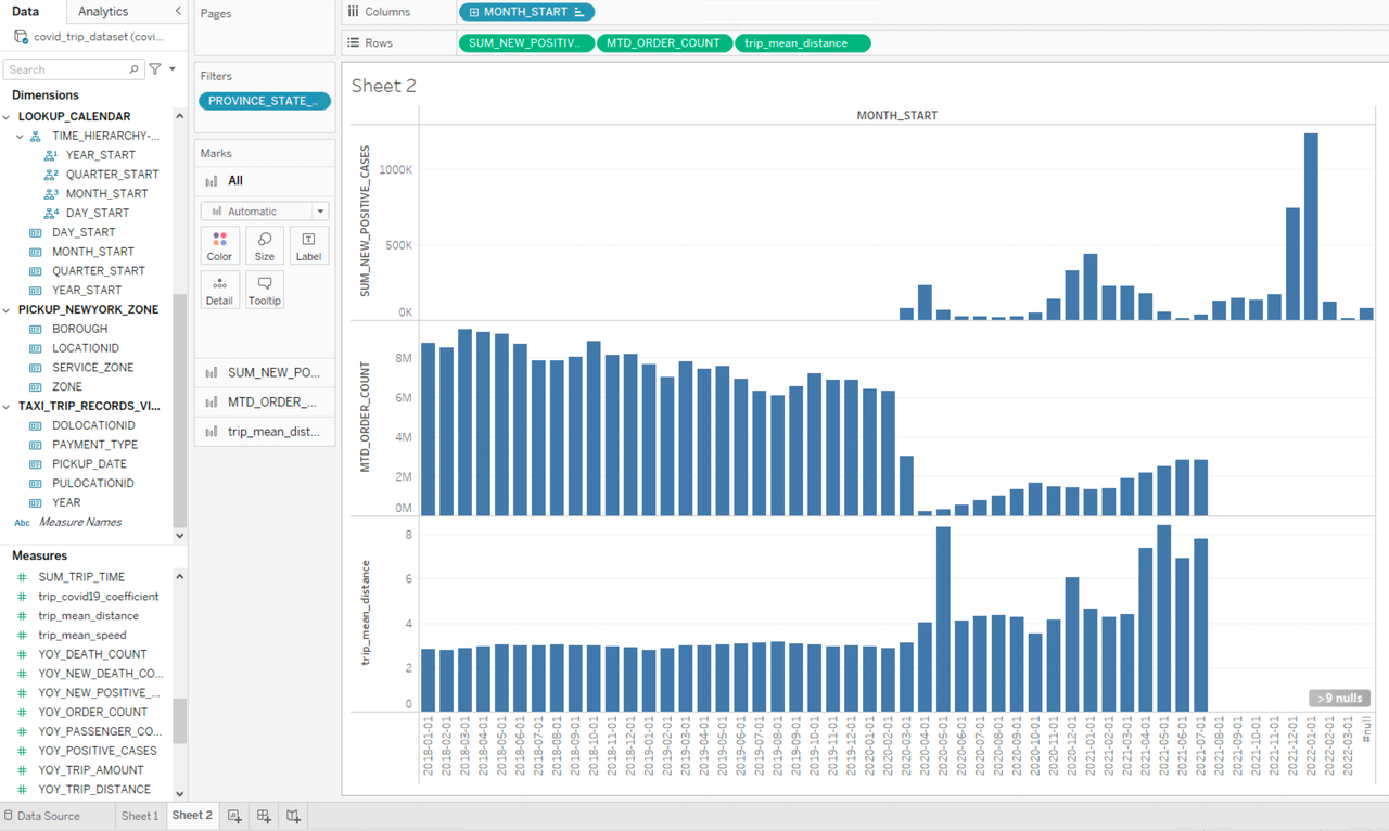
It is interesting to see that the number of taxi orders decreased sharply at the beginning of the outbreak while the average trip mileage increased, indicating people have cut unnecessary short-distance travels or switched to a safer means of transportation. By comparing the data curves, we can see that the severity of the pandemic and people’s travel patterns are highly related, taxi orders drop and average trip mileage increases when the pandemic worsens, while when the situation improves, taxi order increases while average trip mileage drops.
Data analysis via Excel
With MDX for Kylin, we can also use Kylin for big data analysis with Excel. In this test, we will use Excel installed on a local Windows machine to connect MDX for Kylin.
-
Open Excel, select
Data->Get Data->From Database->From Analysis Services: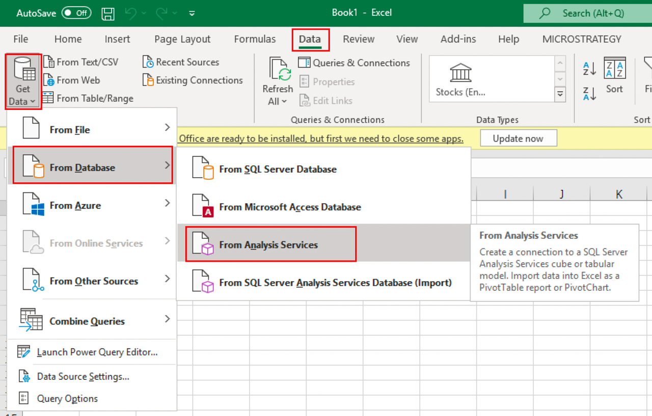
-
In
Data Connection Wizard, enter the connection information as the server name:http://${kylin_node_public_ip}:7080/mdx/xmla/covid_trip_project: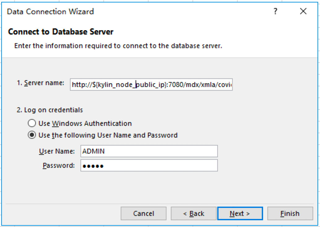
-
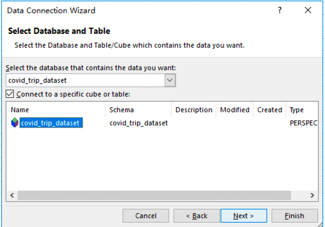
Then create a PivotTable for this data connection. We can see the data listed here is the same as that when we are using Tableau. So no matter whether analysts are using Tableau or Excel, they are working on identical sets of data models, dimensions, and business metrics, thereby realizing unified semantics.
-
We have just created a pandemic map and run a trend analysis using
covid19andnewyork_trip_datawith Tableau. In Excel, we can check more details for the same datasets and data scenarios.
- For COVID-19 related data, we add
REGION_HIERARCHYand pre-definedSUM_NEW_POSITIVE_CASESand mortality rateCFR_COVID19to the PivotTable:
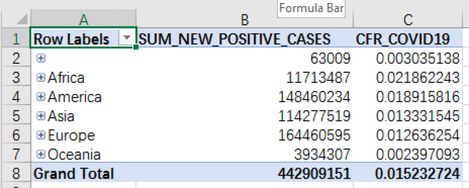
The highest level of the regional hierarchy is CONTINENT_NAME, which includes the number of confirmed cases and mortality rate in each continent. We can see that Europe has the highest number of confirmed cases while Africa has the highest mortality rate. In this PivotTable, we can easily drill down to lower regional levels to check more fine-grained data, such as data from different Asian countries, and sort them in descending order according to the number of confirmed cases:
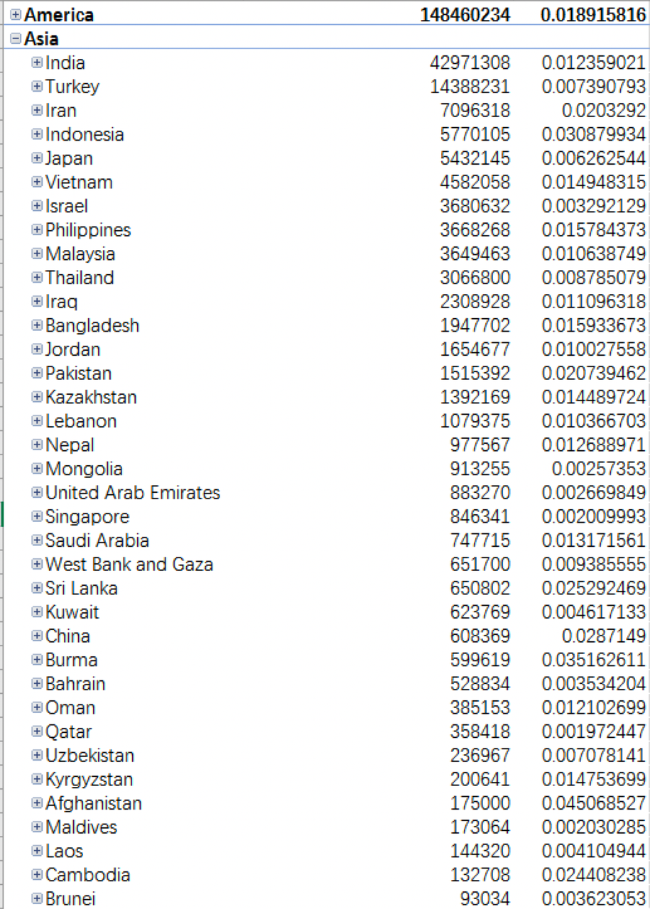
The data shows that India, Turkey, and Iran are the countries with the highest number of confirmed cases.
- Regarding the problem, does the pandemic have a significant impact on taxi orders, we first look at the YTD and growth rate of taxi orders from the year dimension by creating a PivotTable with
TIME_HIERARCHY,YOY_ORDER_COUNT, andYTD_ORDER_COUNTas the dimension for time hierarchy:
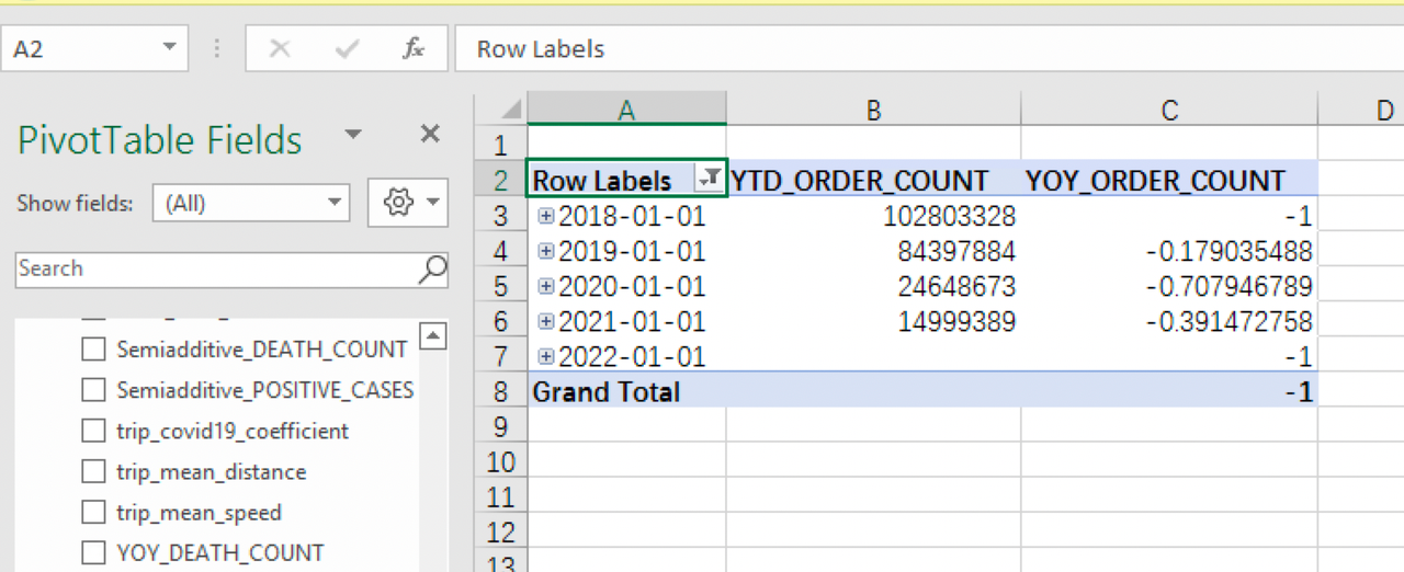
It can be seen that since the outbreak of the pandemic in 2020, there is a sharp decrease in taxi orders. The growth rate in 2020 is -0.7079, that is, a reduction of 70% in taxi orders. The growth rate in 2021 is still negative, but the decrease is not so obvious compared to 2020 when the pandemic just started.
Click to expand the time hierarchy to view the data at quarter, month, and even day levels. By selecting MOM_ORDER_COUNT and ORDER_COUNT, we can check the monthly order growth rate and order numbers in different time hierarchies:
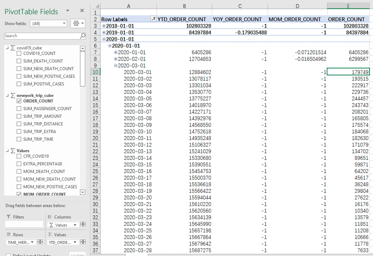
The order growth rate in March 2020 was -0.52, which is already a significant fall. The rate dropped even further to -0.92 in April, that is, a 90% reduction in orders. Then the decreasing rate becomes less obvious. But taxi orders were still much lower than before the outbreak.
Use API to integrate Kylin with data analysis platform
In addition to mainstream BI tools such as Excel and Tableau, many companies also like to develop their in-house data analysis platforms. For such self-developed data analysis platforms, users can still use Kylin + MDX for Kylin as the base for the analysis platform by calling API to ensure a unified data definition. In the following part, we will show you how to send a query to MDX for Kylin through Olap4j, the Java library similar to JDBC driver that can access any OLAP service.
We also provide a simple demo for our users, you may click mdx query demo to download the source code.
-
Download jar package for the demo:
wget https://s3.cn-north-1.amazonaws.com.cn/public.kyligence.io/kylin/kylin_demo/mdx_query_demo.tgz tar -xvf mdx_query_demo.tgz cd mdx_query_demo -
Run demo
Make sure Java 8 is installed before running the demo:
Two parameters are needed to run the demo: the IP of the MDX node and the MDX query to be run. The default port is 7080. The MDX node IP here is the public IP of the Kylin node.
java -cp olap4j-xmla-1.2.0.jar:olap4j-1.2.0.jar:xercesImpl-2.9.1.jar:mdx-query-demo-0.0.1.jar io.kyligence.mdxquerydemo.MdxQueryDemoApplication "${kylin_node_public_ip}" "${mdx_query}"
Or you could just enter the IP of the MDX node, the system will automatically run the following MDX statement to count the order number and average trip mileage of each borough according to the pickup ID:
SELECT
{[Measures].[ORDER_COUNT],
[Measures].[trip_mean_distance]}
DIMENSION PROPERTIES [MEMBER_UNIQUE_NAME],[MEMBER_ORDINAL],[MEMBER_CAPTION] ON COLUMNS,
NON EMPTY [PICKUP_NEWYORK_ZONE].[BOROUGH].[BOROUGH].AllMembers
DIMENSION PROPERTIES [MEMBER_UNIQUE_NAME],[MEMBER_ORDINAL],[MEMBER_CAPTION] ON ROWS
FROM [covid_trip_dataset]
We will also use the default query in this tutorial. After the execution is completed, we can get the query result in the command line:
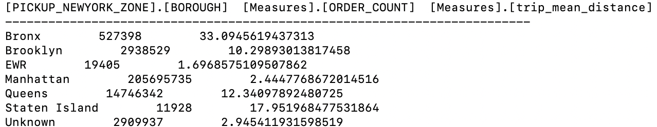
As you can see, we have successfully obtained the data needed. The result shows that the largest number of taxi orders are from Manhattan, with an average order distance of only about 2.4 miles, which is reasonable if we consider the area and dense population in Manhattan; while the average distance of orders departing from Bronx is 33 miles, much higher than any other boroughs, probably due to Bronx’s remote location.
As with Tableau and Excel, the MDX statement here can directly use the metrics defined in Kylin and MDX for Kylin. Users can do further analysis of the data with their own data analysis platform.
Unified data definition
We have demonstrated 3 ways to work with Kylin + MDX for Kylin, from which we can see that with the help of Kylin multi-dimensional database and MDX for Kylin semantic layer, no matter which data analytic system you are using, you can always use the same data model and business metrics and enjoy the advantages brought by unified semantics.
Delete clusters
Delete query cluster
After the analysis, we can execute the cluster destruction command to delete the query cluster. If you also want to delete metadata database RDS, monitor node and VPC of Kylin and MDX for Kylin, you can execute the following cluster destroy command:
python deploy.py --type destroy-all
Check AWS resources
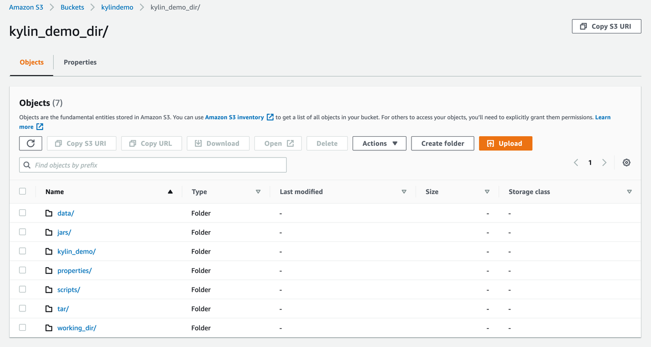
After all cluster resources are deleted, there should be no Kylin deployment tool-related Stack on CloudFormation. If you also want to delete the deployment-related files and data from S3, you can manually delete the following folders under the S3 working directory:
Summary
You only need an AWS account to follow the steps in this tutorial to explore our Kylin deployment tool on the Cloud. Kylin + MDX for Kylin, with our pre-computation technology, multi-dimensional models, and basic metrics management capabilities, enables users to build a big data analysis platform on the cloud in a convenient way. In addition, we also support seamless connection to mainstream BI tools, helping our users to better leverage their data with higher efficiency and the lowest TCO.